That said, the bar continues to get higher and higher for me to pledge. I notice that the coloring on the Queen of Hearts is very muted in the first deck. No red at all for a heart court? Also, the King of Diamonds appears to be the Suicide King, which is very interestingly drawn but it does buck with tradition.
We've been having a lot of decks with this kind of theme lately. This one actually seems to be slightly above the crowd for this theme, actually, but it's still not a theme that generally grabs me. The lack of color in the hearts for that first deck is not drawing me in.
I wish this project all great success because I see a lot of talent here, but while I'm totally fine with playing with traditions (like having KoD be the Suicide King instead of KoH), this deck isn't quite getting me there just now.
Edit: Adding these observations: 1) I don't like the font choice of the index; very hard to read. 2) Love what I see of the back design. Really, really good. 3) I'm not generally a fan of the black-and-white court illustration on an otherwise colored deck. These are nonetheless very good, even so. I just need more color elsewhere.
Edit #2: Just looked at the KS page. I see the full backs there. Still like them! I see number cards. Without color in the pips and because of the ornate drawing of the pips, they are more difficult to discern from each other than necessary. Rareplayingcards.com is driving this project. They are, in my experience, rock solid. I have every confidence that this project will be fulfilled expertly. So... yeah. A lot to like here, but it's not yet clearing my bar with regard to what I look for in the art (even given how good the art is). And I definitely hope Forge Arts is able to make their first KS project a success.
I agree with the lack of color on the hearts, but overall I would have liked a bit more in general. I really like the artwork here, but the killer is the price - $17 shipped with the previously mentioned issues. I would have liked this one, but I think I'll just say good luck instead.
I think the artwork and theme on this deck are great. I especially like the Hansel and Gretel Jack of Spades. But $17.00 per deck shipped for a Legends printed deck is excessive, especially when you consider there is no embossing, foiling, or other bells and whistles on the tuck. I know they're possible as stretch goals, but let's be real here, $17.00 is too much even if they had these tuck features to start with. We're at a day and age where we can get foil-backed cards for under $20 (and in the case of the T11 Gold Rarebits, under $10). Forget about foil on the cards, these don't even have them on the tucks and they want $17.00. So despite the artwork, this is an easy pass for me, there's just too many other great decks coming out now at much better value for me to spend any consideration on an overpriced deck like this one.
Hey everyone, Matt from RPC here. Just stopping by. I appreciate all of the feedback (good or bad)
This is my first project and something I'm really excited about. Nicolai and I have been working on it for a while now. I've handled hundreds of decks over the years but always wanted one with an old Germanic theme (being German myself), which is what inspired the project.
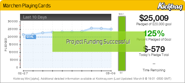
So far we're nearly 50% funded after 40 hours so I'm hoping for a successful campaign. Thanks for your wishes!
I know that some of you are upset about the price. I completely understand and it's something that I will seriously consider for the next project. We are already operating on very thin margins whereas a single designer launching their own project may have a little more leeway in offering free US shipping. But it's something that I'll learn from and keep in mind for the future. It certainly doesn't help that USPS (and others) just increased shipping costs by 5% a few weeks ago. And that's on top of another big increase that happened last year. Fuel prices are decreasing yet shipping costs continue to go up, funny how that works!
To address some questions:
@rousselle - Thanks for the in-depth feedback. As for the muted coloring, this is likely due to the digital mock-up images. I can assure you that the colors will "pop" more in the final product in both because of the metallic inks and printing process. The hearts are red in the Hamelin edition, which is more colorful to reflect the towns and castles of Germany. The Schwarzwald deck is a bit more subdued as it's based off Germany's Black Forest and has a darker element behind the story. Hence those pips being a golden color instead of red. I'll forward your concern about the indexes being hard to read to the designer. Small refinements can always be made before production.
Hamelin's pips (including hearts) are red, as in this example below:
@Bikefanatic - The KoD and KoH could possibly be swapped. I'll make note of this and gather additional information from backers to see if they can be changed in the production version.
Whether you decide to back the deck or not (design preferences or price) I do appreciate the support even if the theme is not for you
I'm super excited to produce these decks and their add-ons. We'll be ensuring the utmost quality and perfection which has always been in line with RPC's standards and reputation.
Rareplayingcards is having an early Black Friday sale. 40% off a very nice selection of decks, including the Marchen set. Grab these if you missed it. It's one of Nicolai's early decks (3rd).