The concept could be a good one, but the execution is extremely sloppy. I absolutely appreciate a fully-custom approach - it's always refreshing. But the artwork is too clumsy and muddled to take this one seriously. The gold overlay for the signature edition is just baffling. I just wish more producers would come by and talk with collectors and maybe get some input.
Also, $129 for one signature deck (signed by the artist!).....WOW
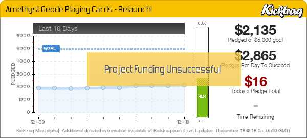
Attachments
09d1a41230beaeac61efee521c94f0ed_original.png (355.7 KiB) Viewed 1286 times
Hello BaconWise, I appreciate your feedback. I think you are correct in suggesting that it would be wise for producers to talk to collectors and get their input. Though it is a little late in the process, I would like to hear what it is you feel can be improved with this deck if you are willing to provide expanded input. I would love to implement any improvements to the deck before the campaign ends and before we go into production if we are successful.
For me as a minor collector, I am always disapointed when I get a deck of cards that is not entirely custom, so I am happy to hear that this is appreciated!
I am glad you're taking the time to come by here. Keep in mind I don't speak for all collectors, but I can be a little more precise in my suggestions. Give me a bit to put together some points.
Again, I appreciate the effort to create a fully-custom deck of cards. I want to make it clear that I truly support creators who put time and effort into a design and I want to see those creators succeed, especially in a time where standard, low-effort decks are so popular. You are printing with USPCC – one of the foremost, top-tier printers in the industry. We know the card quality will be the best in the business. Backerkit is a solid choice for rewards management – I have backed several campaigns where Backerkit is used on the back end for add-ons and survey management. I haven’t had any experience with Fulfillrite or EasyShip, but it’s obvious you have done research on the mechanics of the campaign and that’s a huge leg up to ensure smooth fulfillment.
My main issue with the deck is the artwork. There are SO. MANY. projects active at any given time on Kickstarter. That is a lot of noise you have to cut through to stand out. It’s also the end of the year when collectors have to consider holiday spending along with their card budget. The deck has to be something amazing to stand out and command support at this point in the year. Your deck doesn’t compel me to buy, so I will share a few reasons:
Tuck Box:
This is the first impression of the deck inside and the tuck box just doesn’t have any life to it. The name of the deck should be clear, but it’s lost in the gray. Don’t be afraid to use more color on the tuck. You have some wonderful purple geode action hidden on the tuck flap. That needs to be brought out more – even more than with the signature edition. It will help a great deal if you can limit the impact of the dull, gray stone texture.
Card Backs:
The artwork on the cards backs is almost there. The geode image is not convincing as a photo-realistic geode so maybe it would be better to go more abstract. I can’t be sure as I don’t have the artistic talent to do either. Also, cardists may not appreciate that the backs are one-way. It’s subtle, but with the direction of the cracks, you can tell it is an asymmetrical image.
Court Cards:
The court cards have no definition. I know the intent was to have them be made out of stone, but the details are lost with that same muddled, gray stone texture used on the tucks. The details look smudged and incomplete – almost like a draft charcoal drawing. I like how the geode is taking over some of the court cards, so that might be a way to improve them more. Perhaps the courts can be made completely out of the fun, geode texture. I don’t know – that could be overkill, but the current stone look is not working.
Pips:
The pips in this deck are great. I think they fit really well and I have no issues there.
Font:
You have a Greek-style font used for the tuck box, then you use a modern sans sarif for the index font. I think those should have more of a connection.
Signature Gold Overlay:
Obviously, the most salient feature of the signature deck is the gold overlay. I honestly don’t see any good reason for the gold treatment. Stylistically, it doesn’t make sense to me. If this deck had elements of jewelry in it, it might make sense as the gold wire used in setting pendants, earrings, and such. As it stands, it is simply an overlay for the same artwork and I think it makes the deck feel dated (think 80’s squiggles in the background of Saved by the Bell). The pricing for your signature deck is unrealistic
CONCLUSION (finally)
I know this is a verbal dump, but I get passionate about custom cards!
This is a situation where your first project might be better as one well-done deck. Forego the signature edition and focus on getting a successful campaign under your belt. Work on getting the geode texture on the outside of the tuck and more involved on the court cards. I would be interested in seeing ONLY geode texture on the card backs with no stone, just as a possibility. Get some more color in there! And, if you are set on doing two decks, why not have the other be a turquoise geode theme or green geode - something that would make sense as another version.
First off, thank you so much for taking the time to write such valuable input. This is all a huge learning experience for me so to get this kind of input is very important.
I hear you about the piles of custom decks out there. And I didn't even take into consideration the time of year I was launching; I have just been working on this deck for so many months that after I got it to where I was ready to share it, I went for it.
Tuck Box:
I hear you about the loads of grey and the lack of exposed geode. My intent for this box was for the tuck box to be just a taste of what is inside and to give you a sense of actually cracking open a geode. I messed around with a few initial concepts where the crack along the front completely carved through it, but as the deck evolved, that got smaller to accommodate the text.
Card Backs:
I agree 100% with making it symmetrical. Almost immediately after launching I realized that I should have done a symmetrical card back and I have actually already nearly finished the design. The abstractness of the stone texture is something I will have to look into.
Court Cards:
Noted. Perhaps a more abstract stone texture will improve this overall. Perhaps these court cards need a polished look like the pips, but I will need to explore it.
Pips:
This is good to hear! The pips where actually the very first piece of artwork I created and was the original inspiration for the entire deck.
Font:
For the font, I went with a chiseled lettering on the front and a more polished look on the faces.
Signature Gold Overlay:
My primary reason for this design was to have two states of the deck, the standard deck being an undisturbed geode, and the signature being cracked open and wrapped back together. Perhaps a better use of this would be to do away with the standard version and have two versions of the signature, one amethyst, and one blue, red or green as you suggested.
I think after this discussion one of my biggest takeaways is that I essentially have two styles going on here, which was my intent, but it may not be working as well as I had hoped. I was shooting for a rough exterior and a polished finish on the inside. I think if I push all of the art to match those pips a little more, with a little more polished feel, it would pull the deck together better.
Again, thanks a lot for your input. I will most definitely take your guidance to heart and do what I can to improve the deck while the campaign is live.
Thank you for putting effort into a design! I am a picky guy, so my response may be a bit more......intense than you might get from other collectors. Best of luck and I'm glad you stopped by!
One more thing! USPCC has been known to have registration issues in the past. Not sure if it's an issue these days or not, but the line work on your signature deck card backs could very possibly get cut off on any given side. You can bleed a texture or color, but you will want to scale the lines in or they have a high chance of falling victim to registration errors.
For me the issue is certainly the artwork, I don't want to be harsh, but it is straight up ugly. There's a reason things like stone and gems etc are usually avoided at all costs. Either you need to make it incredibly realistic, and do it well (see the Hyde Park decks), or you need to do it heavily stylised. There is no in-between, or it will look like a blob as these do. You can't just softly 'paint' stone in this way, stone is texture incarnate. And you've combined that with gems, this may just be one of the most difficult ideas (both technically, and for making it aesthetic) I've ever seen for a design, the kind of thing experienced professionals would think twice about attempting.
You've made an admirable attempt but I don't see any way of salvaging it into a production-ready design without starting again from scratch in a different style/direction. I could see it working as a pencil & watercolour, I've just put 'geode illustration' into google images and there are few different approaches to see, all of which require a high level of skill. If it were me I would consider it a learning experience (as I'm sure you have learnt a lot) and take that experience to help work on other ides, maybe revisiting it a later date when I can do it justice. For every piece of art you see from an artist, there are a dozen more that you don't, it's all part of the process. Just my thoughts.
I've said it before, but grey simply does not work well on playing cards. I've yet to see a deck pull it off successfully, and I think any other color (even the "boring" ones like white, black, beige) is better than grey. Combine that with this being, IMO, a difficult theme for a deck of playing card art, and I don't think it's surprising that you're getting as much criticism as above, regardless of artistic talent.
On a positive note: One thing that really speaks to you as a creator is your willingness to engage with the community and take criticism the way you have, so kudos for that
MagikFingerz wrote:I've said it before, but grey simply does not work well on playing cards. I've yet to see a deck pull it off successfully, and I think any other color (even the "boring" ones like white, black, beige) is better than grey.
Damn it. Now I'm off to work up a grey design that doesn't suck. The good news is I'll probably have forgotten about this by tomorrow. In the mean time, CHALLENGE ACCEPTED
(On topic) I get, conceptually, a lot of what you were going for, from the rocky exterior of the tuck, to the bent gold wire to hold a cracked geode in a pendant. (I think! lol) But there are two things:
1. Those things aren't laid out well in your campaign--or if they are, they aren't easily digestible. Maybe I was lazy and missed it.
2. If you have to do a ton of explaining, the execution of the concept needs some adjusting. Show vs. tell
MagikFingerz wrote:I've said it before, but grey simply does not work well on playing cards. I've yet to see a deck pull it off successfully, and I think any other color (even the "boring" ones like white, black, beige) is better than grey.
Have you seen the finished WIlD WEST: Black Hills Deck yet? The grey looks great on the Face Cards!
Back on topic, I can picture a lot of ways to design a really cool Geode Deck. The theme could be very beautiful, if done well. This design has some good things going for it, but the amount of detail / texture in the grey rock areas are too distracting, especially on the Tuck.
MagikFingerz wrote:I've said it before, but grey simply does not work well on playing cards. I've yet to see a deck pull it off successfully, and I think any other color (even the "boring" ones like white, black, beige) is better than grey.
Have you seen the finished WIlD WEST: Black Hills Deck yet? The grey looks great on the Face Cards!
I don't count backgrounds on faces, I should have specified as the main color of the back design. But I'm glad you got an opportunity to plug your deck, nothing in the rules about subliminal advertising You're absolutely right though, grey in the backgrounds can work well as it breaks the monotony and helps fill the blank space behind court cards.
Just to add what Baconwise said. Pips are nice, Title for the tuck is lost in the details. I get the idea of the cracks making up the title, as you've said, the text got lost in the design.
If you want a good example of courts done well in grey stone, check out Max's Bicycle Marble texture series as a reference. He then launched a Black marble version. See if this helps.
We must have quite different definitions of 'done well' lol. I don't consider what is essentially a photoshop bevel/emboss filter over top of a basic and bland texture to be it.