


Extremely interesting concept, but somehow I feel the back design has elements reminiscent of T11's Provision deck


rousselle wrote:You are a fussy, picky guy.
Lotrek wrote:Given the number of morons produced in the world every day, a pessimist is actually a well informed realist.
Räpylätassu wrote:"Tyhmyydestä sakotetaan." You get fined for being stupid.


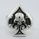
Why not? It's the universal symbol of medicine.venomatic wrote:Although I can't say I'm too crazy about those crosses on the court cards.
yeah, I get that it fits with the theme but personally, it distracts from the overall design or other details (kinda like when an attractive person has an ugly tattoo). But again, just my two cents. Although I would've been okay with it, if it was only 1 court card that had it.Adonael wrote:Why not? It's the universal symbol of medicine.venomatic wrote:Although I can't say I'm too crazy about those crosses on the court cards.
Coming from you, that's almost a compliment!theCapraAegagrus wrote:Mediocrity at its finest.


I'm not a fan of such low goals. You put the whole project at risk if you just make it. He's doing really well though considering it's his second deck and he doesn't appear to have the biggest following.RelativityCards wrote:Dude has straight up murdered his funding goal. Malpractice?
The only one I can think of, is the Provision deck from T11, but it has a pretty different style, imo.Jocu wrote:Something about that back design seems awfully familiar... I know people have mentioned T11 but doesn't a T11 deck have that exact same snakelike design? (Not Monarchs, i mean really that design...) It's bugging me!
I actually quite like the colours and the overall design. As a collector it's not the most interesting theme and I'd prefer proper custom courts, but it's a solid design.
But that back...
Yeah, I think the style is very different, but I do I see the similar attributes of color and the snake. So I started looking into the Caduceus staff and the Rod of Asclepius because of this and learned something new today.caniveski wrote:Provision is similar card back isn't it. I don't have the deck but that is what it's reminding me of


Hey! Don't worry, I wasn't accusing you of plagiarism, it just seemed really familiar. Like, identical to something but I couldn't get it! Must've dreamt it...fh5ve wrote:Hello everyone, I'm the creator of this project and I thought that I'd answer some concerns and inquiries about the deck.
First off, thanks for everyone who's supporting the project! I'm glad that this forum generally has a positive outlook on the deck
For those who wanted a high quality tuckbox, I have a Google Form on the Kickstarter where you can still vote on the stretch goals. Currently leading is: Tuckbox embossing, then custom seals and matte tuckbox are tied. If you'd like to vote you can do so here: https://docs.google.com/forms/d/e/1FAIp ... g/viewform. I will be selecting the stretch goals tomorrow.
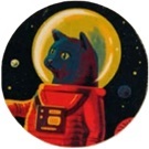
Secondly, I did take inspiration from T11, and although I have not seen DKNG decks before, I love the way T11 decks are designed. Also, I didn't take inspiration from their Provision's deck, but I did take inspiration from the Monarch's. The snake is supposed to be part of the Bowl of Hygeia (google it), so that's why it looks like that. I don't think there's any problem getting inspiration from already successful designs, especially when the theme matches it (it's not even a true copy). It's normal for designers to take inspiration from designs they like, which is why Behance and Dribbble exist anyways.
Thirdly, I do low goals so that they get funded easily Jocu. As you said, I don't have much following, but I am trying to get my designs out there so my brand can grow, even if I don't make any profit. I just bought a screen drawing tablet so I can fully customize the courts for the next few decks, so I hope the community likes the work that I will be putting out soon!
Also, I'm glad someone that hates most decks thinks my deck is at least mediocre


I had the same feeling, but I think a lot of decks share the same art style, so they probably blend together in our heads. That's my hypothesis, anywayJocu wrote:
Hey! Don't worry, I wasn't accusing you of plagiarism, it just seemed really familiar. Like, identical to something but I couldn't get it! Must've dreamt it...

Hi fh5ve,fh5ve wrote:Hello everyone, I'm the creator of this project and I thought that I'd answer some concerns and inquiries about the deck.
First off, thanks for everyone who's supporting the project! I'm glad that this forum generally has a positive outlook on the deck
For those who wanted a high quality tuckbox, I have a Google Form on the Kickstarter where you can still vote on the stretch goals. Currently leading is: Tuckbox embossing, then custom seals and matte tuckbox are tied. If you'd like to vote you can do so here: https://docs.google.com/forms/d/e/1FAIp ... g/viewform. I will be selecting the stretch goals tomorrow.
OMG, YES! 1,000% YES!!!RandyButterfield wrote:I’m not sure if it’s on the list, but I would recommend considering clear UV Spot Ink on the ‘label’ areas of the Tuck Box. UV Spot Ink is a cost effective and VERY powerful tool. It would do a great job of separating shiny label areas from the matte areas. Plus, UV Spot Ink has a subtle Embossing effect with it!
No matter what happens, let that knowledge keep you warm all winter longfh5ve wrote:Also, I'm glad someone that hates most decks thinks my deck is at least mediocre
Well, none of the other scented decks smell good, so...fh5ve wrote:@RelativityCards
LOL I actually don't know what penicillin smells like irl but a quick google search says it definitely doesn't smell good, so I'm gonna pass on that request
Users browsing this forum: brownsl, Evilgamer, Google [Bot], shimmering, Strag and 17 guests