Hey guys! Thanks for the support and feedback.
It’s interesting reading critiques of the design as we go over all this ourselves and it’s definitely a tough part of the design process. The decks are part of an eight deck series where we want each deck to be unique which is why we’re experimenting with some less obvious colour schemes. Grey isn’t my favourite colour either, but in the scheme of the wheel of the year it works well for the period in which Imbolc falls I think.
Another tricky thing is managing the artist/graphic aspects which I’ve come to learn are very different (as someone who can’t draw a thing). Alessandra has many strengths but graphic design is definitely her strongest, hence her usual style and also her doing the graphic design aspects of the decks including the tucks, backs and pips. Evgenia’s strength on the other hand is her beautiful line work art, but this would not work for the graphic elements which need to be more precise and symmetrical.
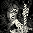
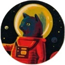
I’m really happy with the balance they’ve come to and Evgenia’s black and white artwork was what drew us to her in the first place, but we obviously need a splash of colour on the rest of the decks or we’d have eight black and white decks

Evgenia’s art cannot be coloured easily without changing the style, so whilst it’s particular I’m please with the result. It’s cool that its not for everyone!
This is our first series of collaborations so I’m really happy they’re going well so far but I think the market for these is definitely more mythology and magic lovers than necessarily card collectors although there’s a big crossover.
There will be more true Jocu decks coming next year with just Alessandra at the helm and we will continue collaborating with various artists under the JocuCollabs account as opportunities arise. Evgenia has been a pleasure to work with and I look forward to seeing what comes next! Stay tuned!