Page 2 of 4
Re: Royal Playing Cards
Posted: Fri Feb 06, 2015 5:10 pm
by Mike Ratledge
Now we're talking! Much better.
Re: Royal Playing Cards
Posted: Fri Feb 06, 2015 6:34 pm
by sprouts1115
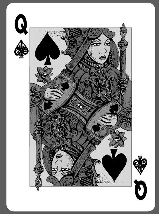
Your index pip is to light. It needs to be darker. What does your club look like? Traditionally, the spade is mostly black and the club can be less than black to a grey. Your spade index pip looks grey to me. Now your suit indicator is black. Traditionally, both are the same. Just saying...
Re: Royal Playing Cards
Posted: Fri Feb 06, 2015 9:55 pm
by volantangel
sprouts1115 wrote:Your index pip is to light. It needs to be darker. What does your club look like? Traditionally, the spade is mostly black and the club can be less than black to a grey. Your spade index pip looks grey to me. Now your suit indicator is black. Traditionally, both are the same. Just saying...
It aint grey, its just giving the illusion of it being grey because of the the holes in the pip.
Re: Royal Playing Cards
Posted: Sat Feb 07, 2015 7:56 pm
by tdubben
Gamblers Warehouse wrote:Changes to the background & adjusted pips.
I really like this. The only thing I would change is the font of the Card Character. I'm not digging that Q. I wish I had a good suggestion but I'm creatively challenged.
Re: Royal Playing Cards
Posted: Tue Feb 10, 2015 1:37 pm
by Gamblers Warehouse
This font looks good !!
Re: Royal Playing Cards
Posted: Tue Feb 10, 2015 8:52 pm
by sprouts1115
@Gambler Warehouse - Just put a thin black border around the spade in the clear spaces to complete it. Yep, It looks a pair of eyeballs that in total at least 51% black. In the club, you have 2 options stay black or go grey. Look at that big suit club indicator that is begging to be grey. Do you risk it...
Re: Royal Playing Cards
Posted: Sat Feb 21, 2015 8:21 am
by JacksonRobinson
I think the drawings are a good start to an interesting deck. However I think the weakest part of these designs both the choice of color and also the value range of those colors. Most of the color choices don't harmonize with each other. A common mistake a lot of designers make is first they will choose colors that are different but then place the value of those colors all the same. A great way to check this issue is to take one of the cards and take out all of the color info and just look at the value.
Notice how on this card once you disregard the color info all of the colors are the same value.
To compensate for this problem artist will then simple just crank up the saturation to try achieve contrast but not touch the value at all. Looking at the colors of a design on a lit computer screen can be very deceiving, especially very saturated colors. The lit monitor will lie to you about its actual value or "brightness" as it is actually lighting the color from behind. Try to create contrast with value only first then add the color, and when adding color, add color that is not 100% saturated.
Re: Royal Playing Cards
Posted: Thu Mar 12, 2015 4:21 pm
by Gamblers Warehouse
What about these colors?
Please let us know !!
Re: Royal Playing Cards
Posted: Thu Mar 12, 2015 4:27 pm
by MagikFingerz
I still like the previous (red and black) revision better than any of these.
Re: Royal Playing Cards
Posted: Thu Mar 12, 2015 6:15 pm
by Mike Ratledge
MagikFingerz wrote:I still like the previous (red and black) revision better than any of these.
I agree, but if it has to be one of those shown in the latest message, I prefer the first one at the top.
Re: Royal Playing Cards
Posted: Thu Mar 12, 2015 10:16 pm
by Yashi
I like the teal/aquamarine one but I think the pips need to be a different color.
Re: Royal Playing Cards
Posted: Thu Mar 12, 2015 11:26 pm
by dazzleguts
I think what Jackson was mentioning about the values is right. The different elements in the drawing need to sit at different visual levels so they are not all clamoring to be seen at once. I like how the colours do that in the earlier yellow and red treatment with the black arm, but the range of colour is missing something and not exactly well matched.
In that one you could use a subtley contrasting colour, a green and/or blue that is warm in tone rather than cool, to use as small highlights, like the red that was used with the teal treatment, but not so popping.
What helps an illustration/painting develop is how the different colours sit side by side on a palette and may be mixed with each other at will. On a computer screen you are assigning colours without that off-the-working-surface comparison, and possible mixing. Makes it difficult.
Re: Royal Playing Cards
Posted: Fri Mar 13, 2015 11:15 pm
by sprouts1115
Gamblers - Glad you closed that spade in the indices. I like the 3-D effect. I find myself looking at the scepter peering out from the court border. Color wise the dominate color for the court should be black for the spade. You could make the minor color Red, but the depends if your Hearts are going to be red. Maybe you could make grey the dominate color in your club. It could be any color; really , grey is just an example. I would try to make the minor color for the Clubs the same color for the Diamonds. Does this make any sense? Suits should be in pairs. I went with purple cos I wanted to risk it...
Re: Royal Playing Cards
Posted: Sun Mar 15, 2015 10:04 am
by Collector
The latest one or the very first one with light grey background and colour lines (contours) inside the design elements instead of their flowing. I think small pips need better centering. IMHO.
Re: Royal Playing Cards
Posted: Thu Mar 19, 2015 11:42 am
by Alyooola
Hello everyone.
1. I very much agree with Jackson, that first round of colors was just....

I really feel that the bright white space is killing what could/should be a beautiful antique-looking design. When we first sat down with the artist who began these cards, he had a similar vision, he just was not able to transfer the color scheme in his head to the cards as had originally planned. I suggested to Eddie that perhaps we give these more of a vintage/beige background coloring rather than the bright white background. It gives the cards a softer feel and makes the faces of the character look less... ghosty.
I just pulled this into photoshop, removed the white space and dropped in an antique paper color/texture. Obviously some of the lines will need to be thickened up, and the rest of the white-space removed in the finished product, this is just to show the vision.
Do you have any other suggestions?
Also we would likely be going with the Teal/Aqua one as a secondary color scheme and I agree with Yashi, I think the pips on that coloring should probably be different.
Re: Royal Playing Cards
Posted: Thu Mar 19, 2015 10:00 pm
by Yashi
Funny how that picture has the same color scheme as the previous one but the beige background has made it much more stunning. I like what I see so far.
Re: Royal Playing Cards
Posted: Thu Mar 19, 2015 11:05 pm
by volantangel
I agree with Yashi, this is the best one yet for me. One thing tho, can you check if the skin tones of the hands are the same as her face ?
Re: Royal Playing Cards
Posted: Fri Mar 20, 2015 12:22 am
by Alyooola
volantangel, haha! you are correct

I was tinkering with the shades in her face and forgot to update the hands to match.
This would definitely be fixed in the final version

Glad that you guys are liking the direction this has taken!
Re: Royal Playing Cards
Posted: Fri Mar 20, 2015 12:46 am
by volantangel
No problem =) Just dont ask me what colour her dress is..
Anyways maybe you can try making the whites of her eyes white, see if that can bring a little more oomph to her face.
Re: Royal Playing Cards (wap)
Posted: Fri Mar 20, 2015 1:27 am
by Cbkimble
Just noticed something about the center of the card. It's not symmetrical and if left will lead to a one-way court.
Royal Pulp releasing this week from Gamblers
Posted: Tue May 19, 2015 7:06 pm
by badpete69
Just saw this on facebook


Re: Royal Pulp releasing this week from Gamblers
Posted: Wed May 20, 2015 11:03 am
by Alyooola
Re: Royal Pulp releasing this week from Gamblers
Posted: Wed May 20, 2015 11:14 am
by badpete69
Hey Alysha.. I knew I remembered seeing something on this but i used pulp in my search of the forums hehehe. I'll merge the topics
Re: Royal Pulp releasing this week from Gamblers
Posted: Wed May 20, 2015 11:15 am
by Firthetic
This is the type of deck I'd buy a brick of, to give as presents to friends interested in graphic design and typography. That is hella sweet.
Re: Royal Pulp releasing this week from Gamblers
Posted: Wed May 20, 2015 11:56 am
by rousselle
So... when? (Okay, I see "this week" in the title of the thread.)
But... when?
Also... where?
Re: Royal Pulp releasing this week from Gamblers
Posted: Wed May 20, 2015 12:01 pm
by badpete69
It will be on Kickstarter Alan. Precise launch date to be announced
Re: Royal Pulp releasing this week from Gamblers
Posted: Wed May 20, 2015 12:16 pm
by Alyooola
Thanks for merging badpete!
Firthetic - that is EXACTLY what I was hoping to hear about this particular deck
We are looking to launch Thursday. Will keep you updated after the project is KS approved.
Thanks guys!
Re: Royal Pulp releasing this week from Gamblers
Posted: Wed May 20, 2015 12:58 pm
by Eoghann
Wowza, that's nice! I particularly love the orange one.
Definitely in.
Re: Royal Pulp releasing this week from Gamblers
Posted: Wed May 20, 2015 1:53 pm
by Thirdway Industries
I like it
Great job.
Re: Royal Pulp releasing this week from Gamblers
Posted: Wed May 20, 2015 4:14 pm
by shermjack
I am definitely in
