
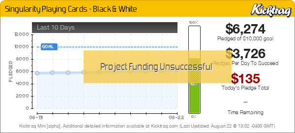


First project, unsuccessful.


rousselle wrote:You are a fussy, picky guy.
Lotrek wrote:Given the number of morons produced in the world every day, a pessimist is actually a well informed realist.
Räpylätassu wrote:"Tyhmyydestä sakotetaan." You get fined for being stupid.

Here ya go!RelativityCards wrote:I assume someone who knows what they are doing can start a new thread for it, but here's a link to the relaunch
https://www.kickstarter.com/projects/re ... -and-white
Thanks, I worked really hard to make it an attractive proposition.Outsider wrote:My opinion hasn't changed, these are some really strange looking cards.
But credit where it's due, $22 shipped for two decks printed on crushed stock is not a bad deal.


Happy to engage!hsbc wrote:I'm appreciative that you're willing to come here and engage with us
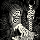
I like the idea of the black-hole/exploding color thing, but I don't think that this is the way to go - the straight lines making up the weird triangle shapes... it just doesn't really work and looks unfinished.
On the back, I'm not exactly sure what I'd add but I feel like it needs something. Maybe the edges should be borderless? And the pips that have the black hole effect, they're uneven - look at the bottom of the 7 of hearts - and then they just stop to create a border around the card when necessary? And with the dark edition, the courts need to have the box color changed - see the king of diamonds, the border around the actual court illustration is basically invisible
I hope that helps explain?
Stone cold? I have no idea what you're going for here, aesthetically. It looks like maybe "chaos" is the idea judging from the out of order uncut sheet and yet the courts are rather repetitive, several of them just look like they have stoner eyes.RelativityCards wrote:But speaking of, what is it about the design that's most visually offensive to you?
Oof. Stone cold indeedOutsider wrote:Stone cold? I have no idea what you're going for here, aesthetically. It looks like maybe "chaos" is the idea judging from the out of order uncut sheet and yet the courts are rather repetitive, several of them just look like they have stoner eyes.RelativityCards wrote:But speaking of, what is it about the design that's most visually offensive to you?
The white backs suffer from way too much white space. Black cards somewhat solve that, but it still seems a little empty. The border also sticks out on the design like a sore thumb considering the rest of the card has nothing.
The "exploding head" king is probably the most visually interesting court, and it's good for pretty much one court only regardless of how much time or detail went into it. But it's a gaff, because nothing else even comes close. If every court card had something unique and about this strange going on, you might have something. Not necessarily something I'd love, but something.


Updated the first posthsbc wrote:I reported your post with a note asking a moderator to update the first post
I hope I don't get yelled at
rousselle wrote:You are a fussy, picky guy.
Lotrek wrote:Given the number of morons produced in the world every day, a pessimist is actually a well informed realist.
Räpylätassu wrote:"Tyhmyydestä sakotetaan." You get fined for being stupid.
Users browsing this forum: cere23, Evilgamer, vasta41 and 8 guests